A redesign of Men’s Journal
Improving reading experience on desktop and mobile


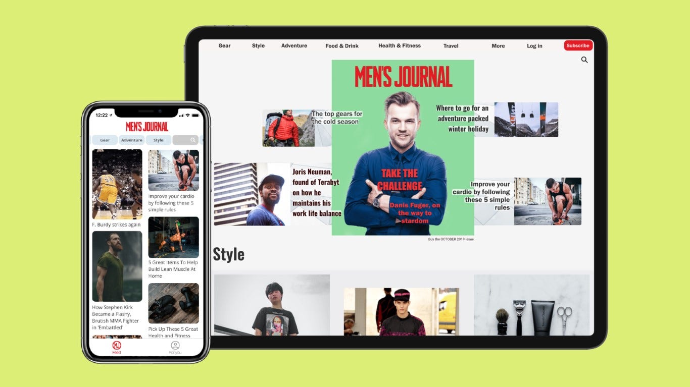
This project is a redesign of a men’s lifestyle magazine. Most of these magazines feature a limited app that displays the pdf of the monthly issue. I suggest an interactive design for both the app and the website for Men’s Journal, to differentiate itself from others, with a better reading experience.
Objectives
Create a blog website that shows the latest articles on the Homepage, encourages users to sign up to the magazine and help the user navigate easily from one topic to another.
- Currently, the Men’ s Journal website have a standardized web design. The aim here will be to make the website closer to the design of the original hardcopy magazine so that they make a consistent brand.
- Also, the current mobile version of Men’s Journal undermines a good reading experience since it displays the magazine pdf. Using a pdf makes the content not adapted to the mobile screen, forcing the user to zoom in and zoom out to go to the next page. Therefore, mobile design will be of focus in this project.
Platform
Desktop screens and app screens will provided in this project.
Target audience
User persona 1: Jonathan, 27 years old. Wants the journal ready at hand on his phone. Expects the magazine to be easy to read on mobile, can log in easily into his account and have bookmarked articles and when he comes back to an article, he can go back to where he has stopped.
User persona 2: Ben, 36. Has been subscribed to the print version for a few years. Hesitating to digital. He wants to be able to have a good preview first, so an excellent free experience on mobile and website are required, and it must be easy to sign up.
Reference
I have found insightful reviews of the app in the apple store, which helped me build the user personas. Some reviews underline about PDF format: “This app does not allow you to read and interact with magazine. It does not remember where you leave off last time your reading”. It is also a challenge to find one’s account when opening the app. Thus, a need to restore interactive content to be attractive and encourage new subscribers to sign up to the digital version of the magazine.
I remembered this citation from Jakob Nielsen, pioneer of usability in design, throughout the design process:
Your homepage is often your first — and possibly your last — chance to attract and retain each customer, rather like the front page of a newspaper.(Nielsen, 2001)
Deliverables
The high fidelity prototype includes:
- An interactive Landing page that encourage sign up and browsing by category.
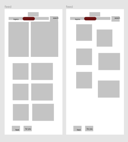
- An app home screen where the user can go from one category to another, with visual thumbnails to identify the topic of each article at first glance and make the mobile experience more appealing.


- A personal recommendation page (that also include settings to avoid overcrowding the bottom navigation bar) on the app so that the user can find his or her favorite articles and get personal recommendations.


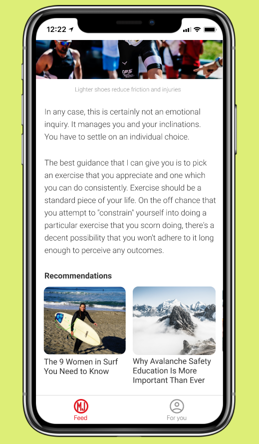
- A page per article so that the reading experience is optimal, with the option to save it. Recommendations or ads can be place at the end, to least undermine the reading experience.


Hope you have enjoyed this article, please make sure to have a look on my thought-process on other projects on my profile.
Hi, I’m Gwenn Le Pechoux, a Product Designer based in Kuala Lumpur, Malaysia. Here are some of my projects through my personal portfolio. And let’s connect on LinkedIn!
References
Nielsen, J. (2001). 113 Design Guidelines for Homepage Usability. Retrieved 17 December 2020, from https://www.nngroup.com/articles/113-design-guidelines-homepage-usability/
